Urban Sketch Lab
A digital sketching tool used to express ideas about re-designing urban space
After initially contracting Digital Eskimo to develop their new event website and blog, the UNSW’s National Institute of Experimental Arts (NIEA) asked us to partner with them to create an interactive installation for the event, the HotHouse Symposium at the Sydney Opera House.
Initially the event website and art installation were going to separate projects. After a quick brainstorm with one the engineers I asked if I could take on both projects because I felt there was an opportunity to connect the installation with something online. After all it would be sad if the outcomes of the installation were only visible at the event. My boss agreed.
Developing the concept
Creating the Sketch Lab from concept to completion was a collaborative process.
To begin with we needed to understand more about what the event was aiming to achieve, what message NIEA wanted to give people coming to the event. I found we needed to explore the branding of HotHouse before we could start to develop concepts that were in tune with the aims of the event.

Photo of the branding workshop session

Photos of the stakeholders workshop session
In the early stages I ran brainstorming sessions with our designers and engineers, workshopped ideas with NIEA staff, artists and curators, and even had the opportunity to explore ideas with a visiting artist and computer scientist from Holland.
One of the developers had been experimenting with some open source software that allowed you to use wii remotes to turn any surface into an interactive whiteboard. This inspired us with an idea for the installation.

Concept sketch
We came up with the concept of having images of well-known sites around Sydney projected onto a digital drawing table, which artists at the event could then sketch over with their ideas using an infra-red pen.
We connected this with the event website by having people create profiles as part of the registration prcess. The sketches from the event were then uploaded to the site and linked with the profiles of attendees so that people could continue to discuss and share their sketches.
Prototyping
With a short timeline to design and develop the interface and build the table, we created a prototype using spare wood, parts of other tables, our bathroom mirror(!) and, amongst other things, a sheet of humble tracing paper. Our first infra-red pen was actually made using a glue stick. This large contraption attracted a lot of attention around the studio which also gave us a good opportunity to gather some early user feedback from colleagues.


Testing the prototype in the studio

Designing the drawing table
Setting up a simple prototype proved invaluable, not just from the lessons we learned on the user interface but it also proved incredibly useful when we began to collaborate with an industrial artist to build the physical table.

We were keen to work with Chris Fox a friend of Digital Eskimo and exceptional sculptural artist. Chris immediately got what we were aiming to do with the Sketch Lab concept and took measurements and schematic information directly from the prototype.
Most of the basic setup used for the prototype was maintained in the final version for the event (which utilised an old architects drawing table heavily customised for our purposes) even down to the use of tracing paper (between perspex screens) to create a surface that would reflect the projection.
The SketchLab interface
We wanted to have a few options for the infrared pen but still keep the images of Sydney quite big. Initially using some sample images we found that contrast was important to be able to see the sketches over the images. Initially we had a tool palette with colors and different paintbrush sizes for the pen to use.
The UI started to get too complex and so we simplified it to shades of gray and had 4 brush options with different sizes and brush types. It took quite a few iterations to get to the right set of pen tools. As well as staff testing the interface we invited friends and artists and NIEA staff to come in so we could get feedback.

Blog and event website
We kept the design style of the blog and event websites similar. There was no existing branding for HotHouse other than a logo. I ran a visual branding exercise with colleagues based on the outcomes of the workshop branding exercise to help us determine the look and feel.


We wanted something that felt scientific and organic. We had to accommodate for quite a few logos. We also new that there would be a lot of good photos on the blog from artists so we wanted a simple design that didn't take away from the photos.
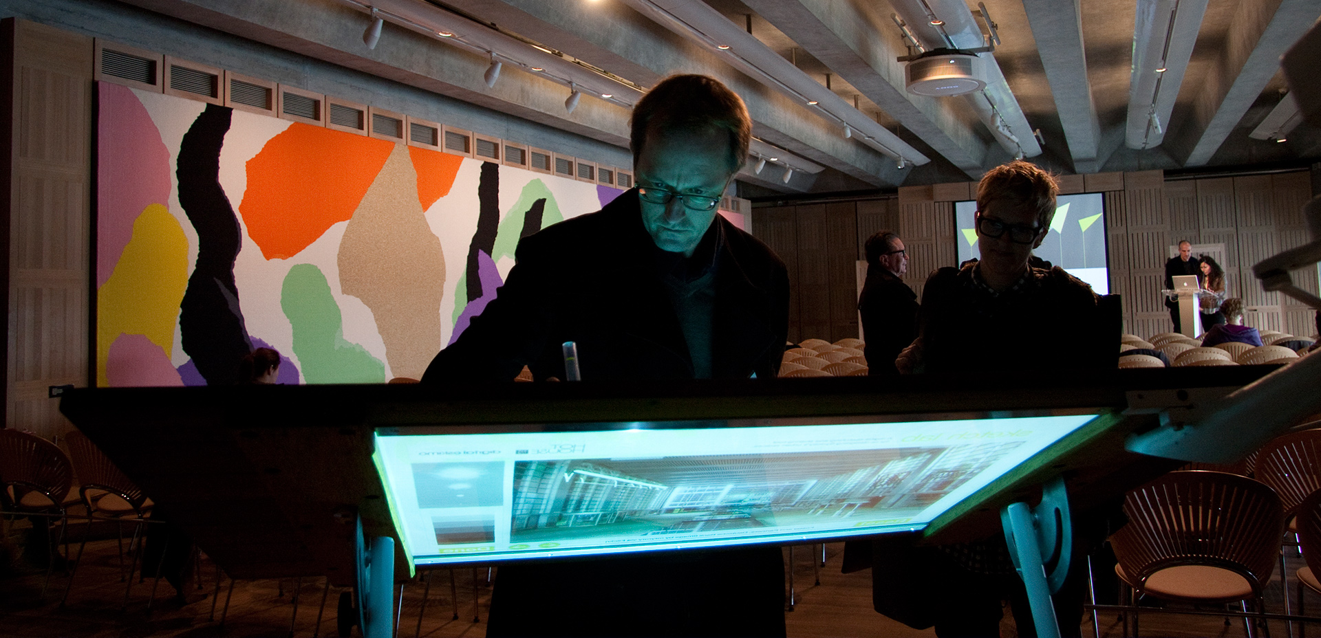
User testing at the event
The HotHouse launch event was the first time we could put the full setup together. We’d tested the software, the table, and pen prototypes, but due to the short timeline we were unable to test the final versions of each component altogether.
This was a bit nerve-wracking but also a fascinating experience from a usability perspective. Observing how different people used the tool first hand gave us important user feedback. Many event attendees also had their own ideas about how the Sketch Lab could be improved or used in different contexts.


Observing and talking with people using the SketchLab at the event
The installation generated a lot of interest online too from those unable to attend as we posted images on flickr. The insights gained from this first-hand user feedback were used to inform how we re-purposed it for a global web conference - Web Directions - as they asked us to develop a custom version as the Sydney events key interactive feature.


Photos of the finished SketchLab at the event