Requests
A new feature to let
users request guides
from each other
After the iPad launch in December 2012 I started my first major project at Snapguide - Requests. It was a feature that felt like a natural addition to the app. We could see evidence that users desired this feature– we'd see comments requesting more guides from guide-makers, and see guide-makers asking for inspiration for their next guide.
Starting out
A former designer began exploring this feature. The team had lots of ideas and questions about how requests should work.
Coming up with fresh ideas and keeping your objectivity becomes harder the deeper you get into designing a feature. After talking with our CEO - Daniel Raffle - to understand our goals, I spent some time brainstorming. I wanted the space to explore ideas without being clouded with constraints and opinions. I then spoke to the team to hear their thoughts.
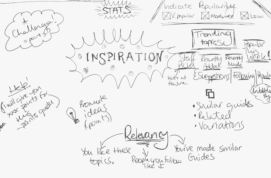
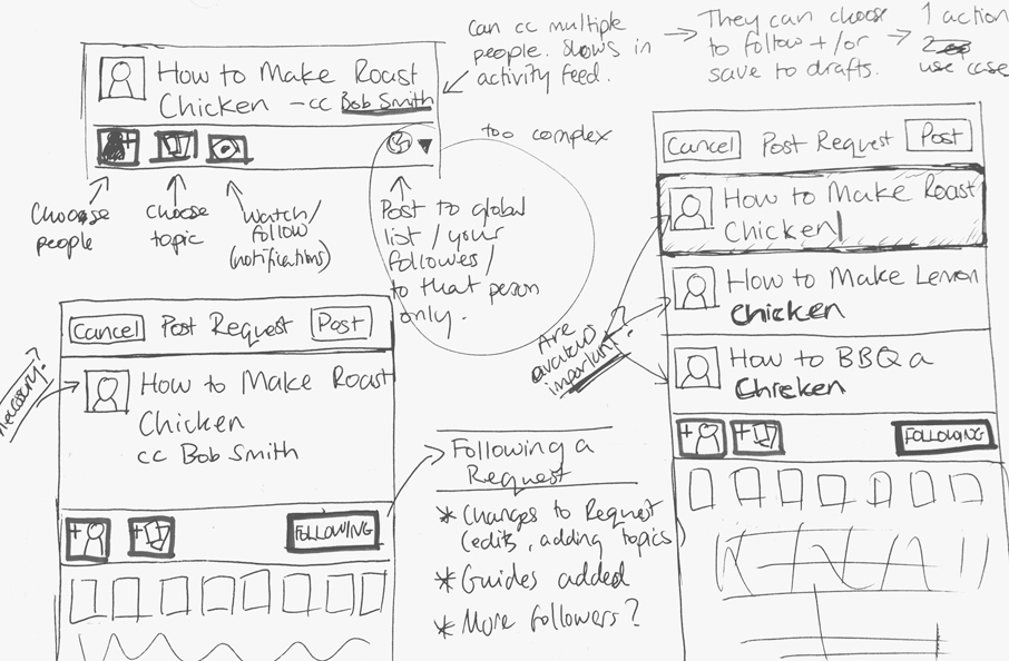
Sketches from brainstorming and exploring ideas
User flows
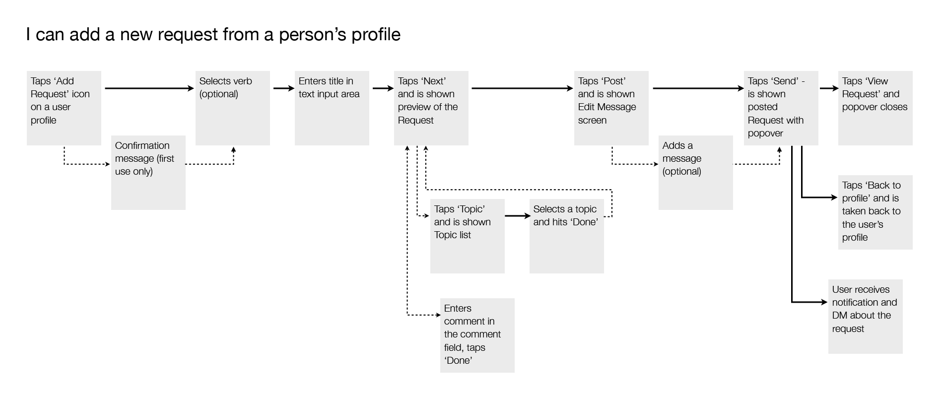
I made user flows so I could map out all the screens, states, and transitions I needed to design. This helped me think about the user's motivations and needs, and uncover gaps in the screens I’d already sketched.
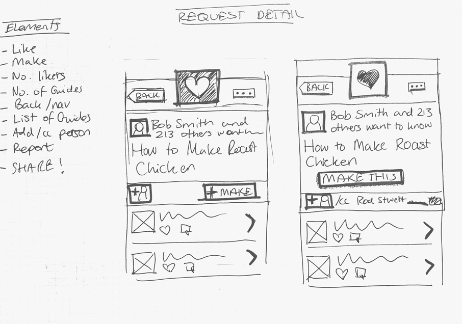
Wireframes & protoypes
Next I made wireframes with annotations. I used them to talk the team through the feature.
The feature was complex and touched a lot of parts of the app. To test the user experience I made a clickable prototype from my wireframes with an app called Prototypes. I was able to click through the screens and see how it felt, and use it to get feedback from staff and friends of Snapguide.
Visual design for iPhone
We wanted to release a beta version to test with users as early as possible. I moved on to wireframing the iPad UI while my colleague took on the visual design for iPhone.
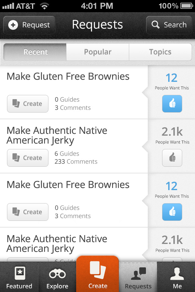
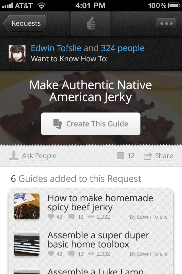
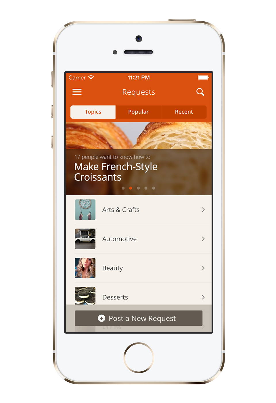
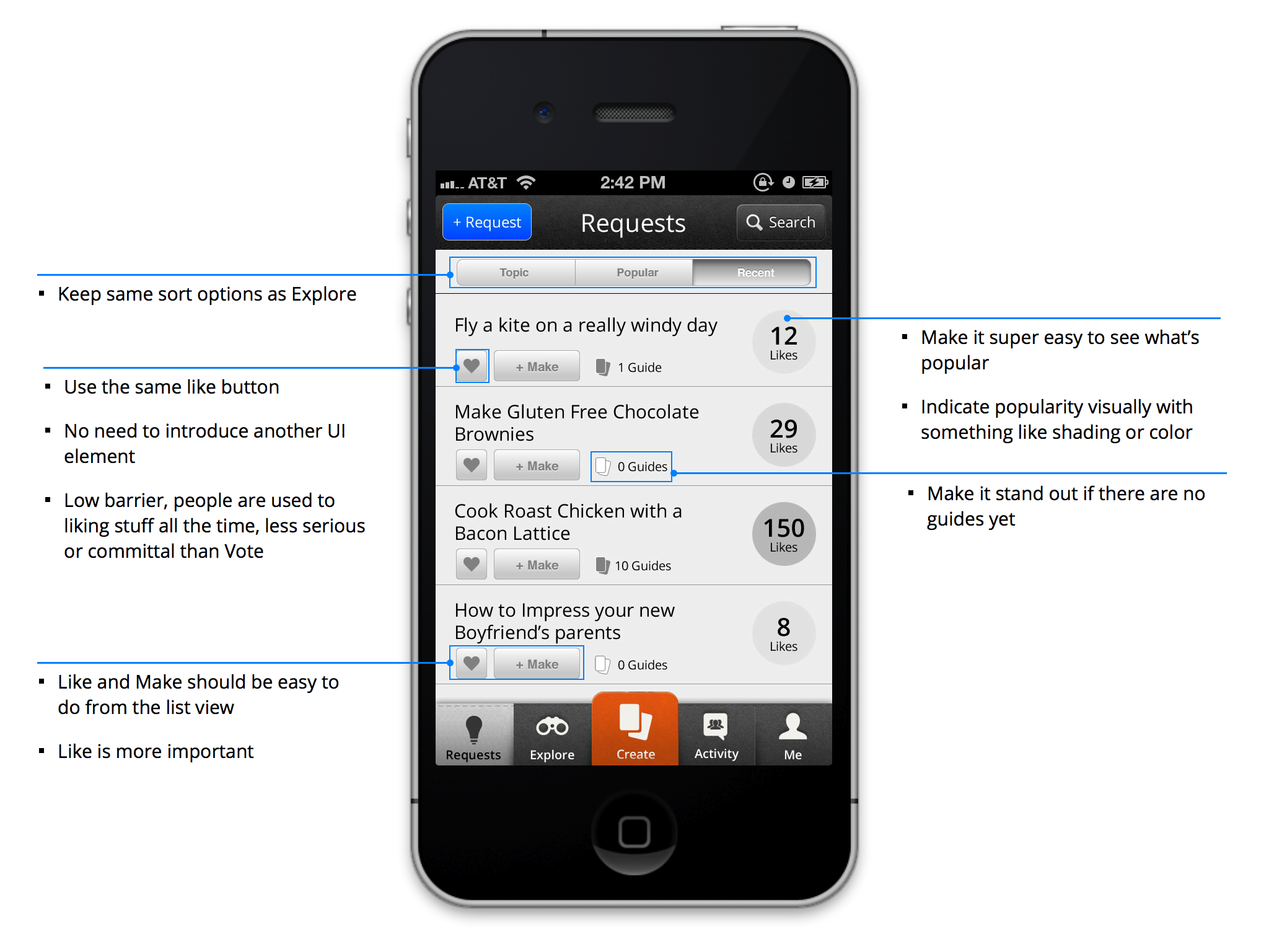
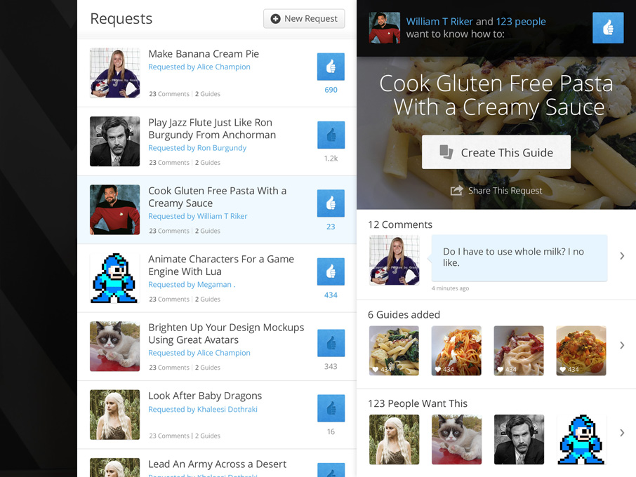
One of the issues that become immediately obvious was the lack of images in the requests interface. Typography alone can be beautiful but the Snapguide app is full of beutiful photos from people’s guides, so the text heavy requests section felt very bland next to that.
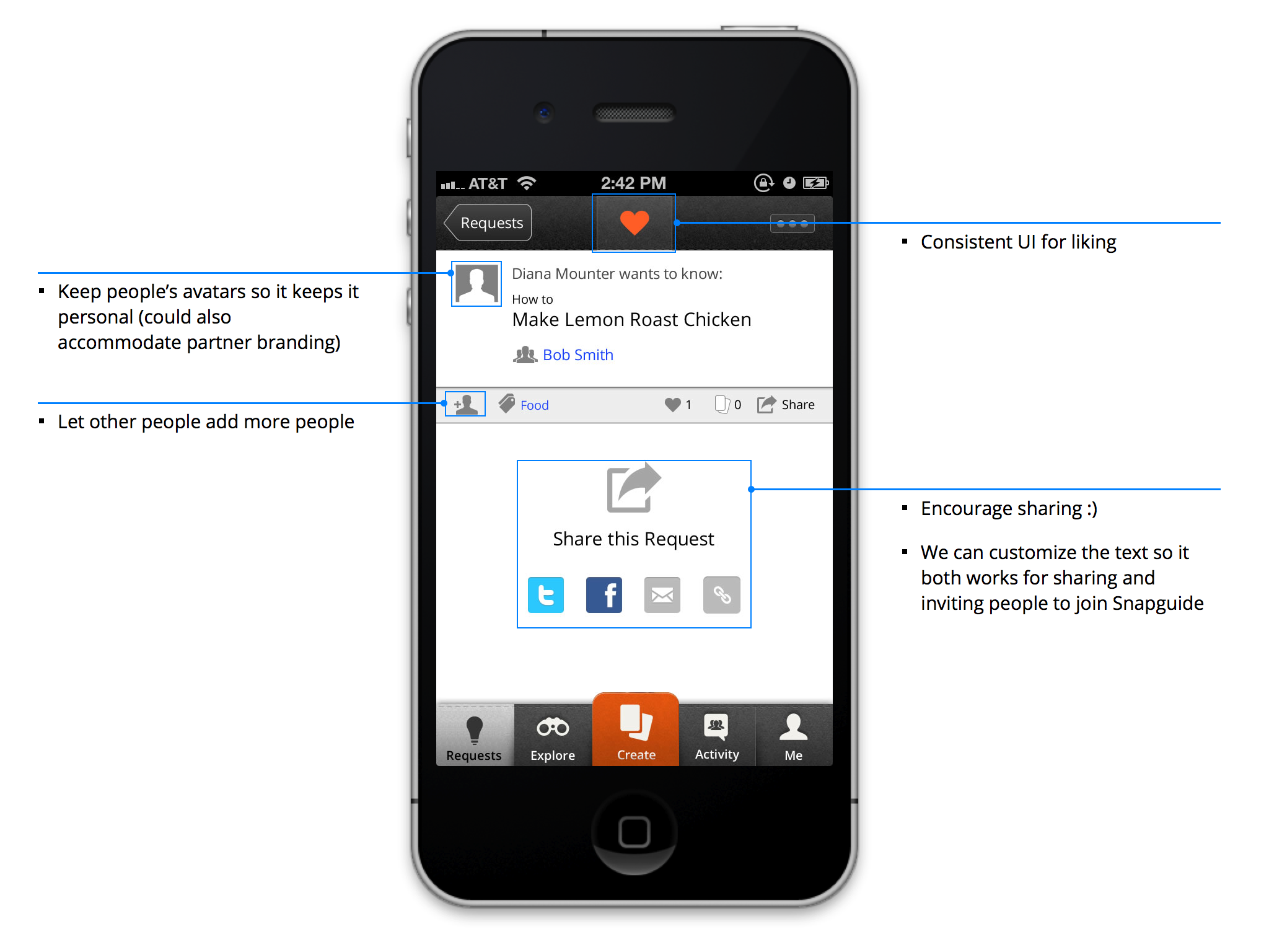
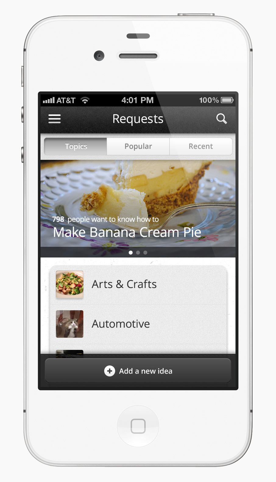
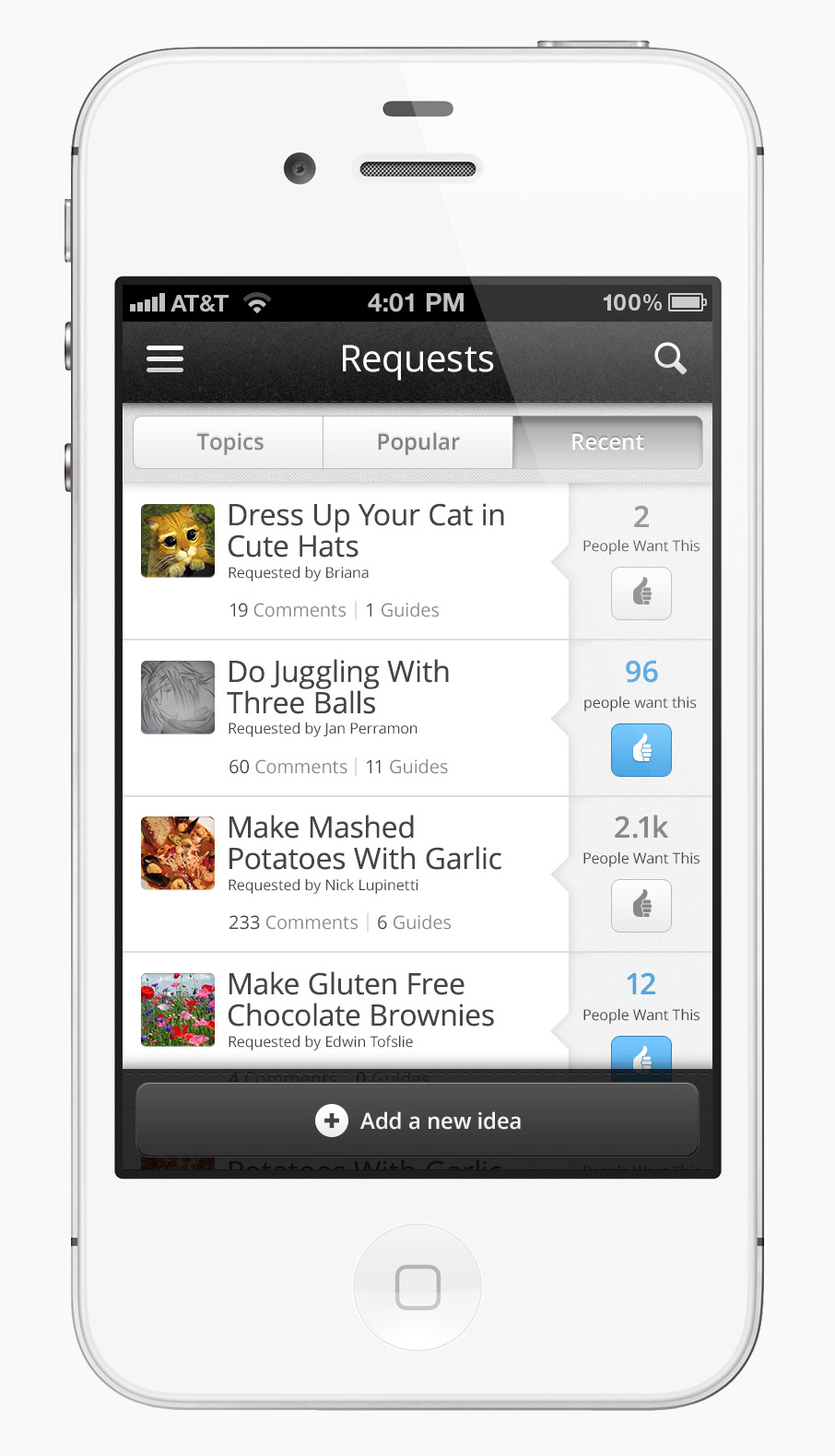
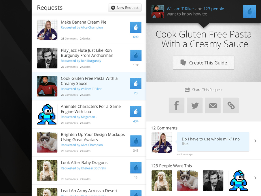
We felt it was a more visually appealing to have the requests home land on topics, and show featured requests at the top with large images. Adding the avatars of the request author helped make the UI feel more friendly and personal. Throughout the app we show avatars with the users content, requests are from people so it made sense to show who was posting them. I re-worked the requests list view to include avatars.
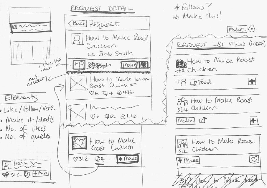
A challenging iPad UI
I had started on iPad wireframes before we decided to add avatars to requests on the iPhone. I found designing a good layout for requests on the iPad particularly challenging. The magazine-style UI lends itself very nicely to large images, but not so well to text heavy screens.
I explored many layouts. After initially trying to find something more unique, I used the same panel-style layout I designed for Profiles.
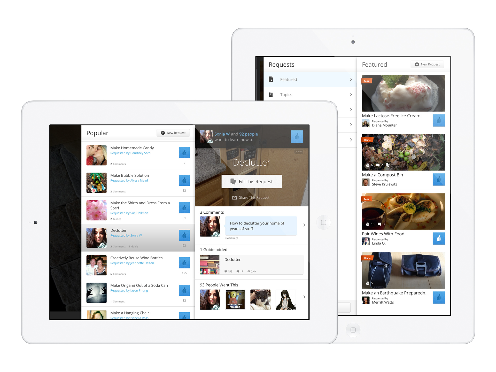
Informed by feedback from beta testers, friends, and colleagues, I designed the requests detail view a little different to the iPhone.
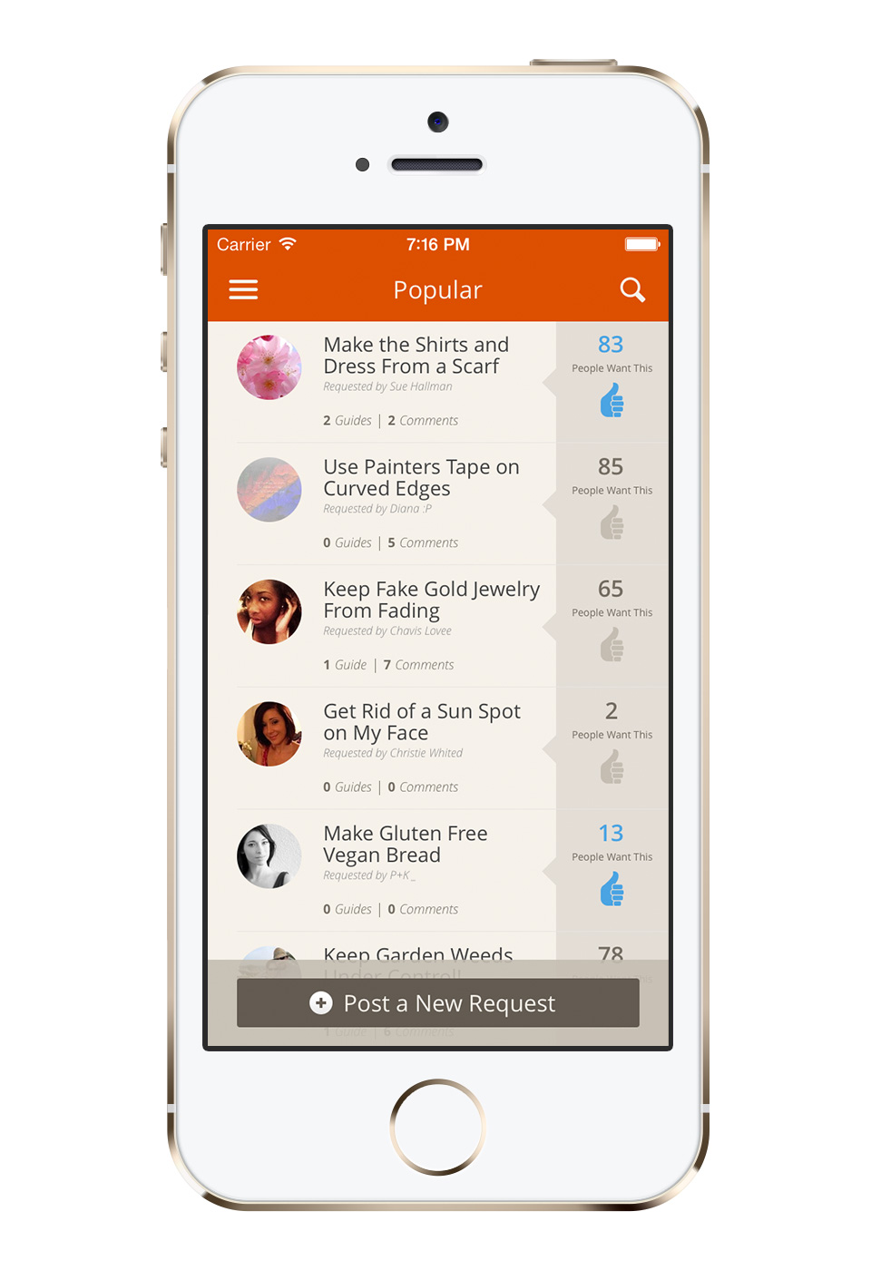
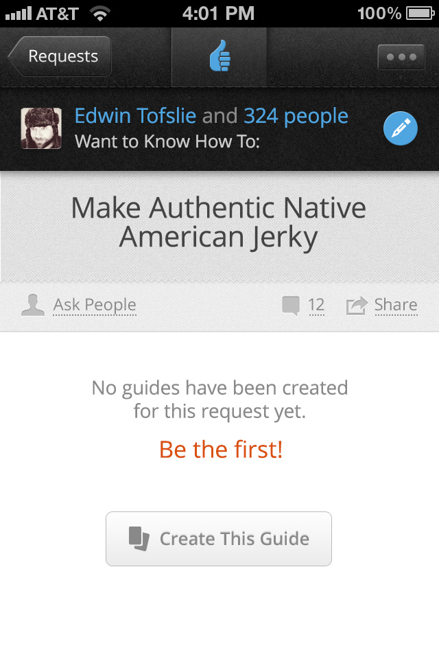
People can interact with requests in 3 ways: they can comment, indicate they want it by tapping the thumbs up icon, or make a guide for the request. When a request is posted there is usually some time before a guide is added. Utilizing the larger screen size of the iPad, I designed the detail view to show comments and avatars of people who want the request as they happen. This makes it feel more interesting until someone adds a guide.
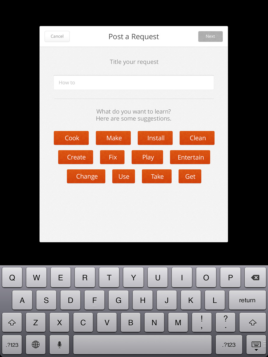
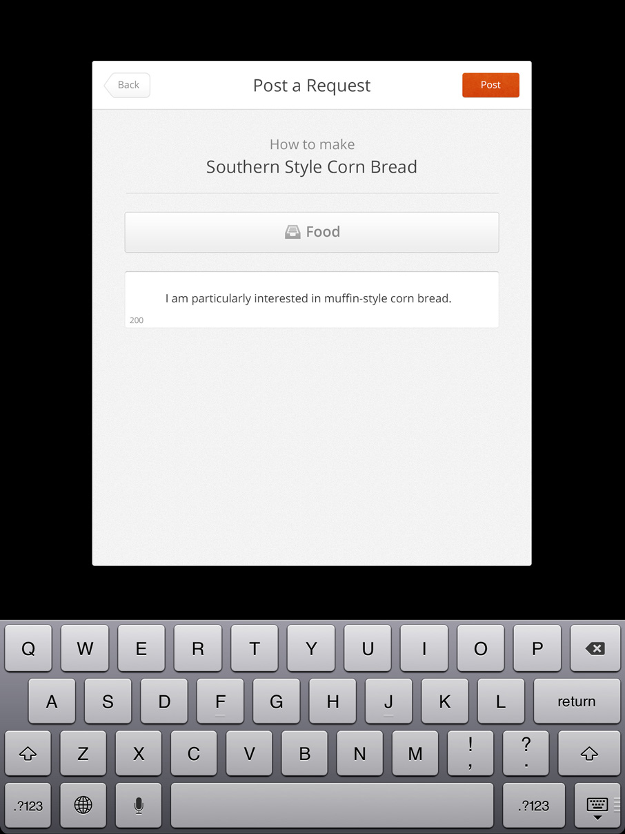
Designing the flow for posting a request didn’t work well in the panels. After exploring a few different tranistions I used a similar UI pattern to what we use for signing into the app.
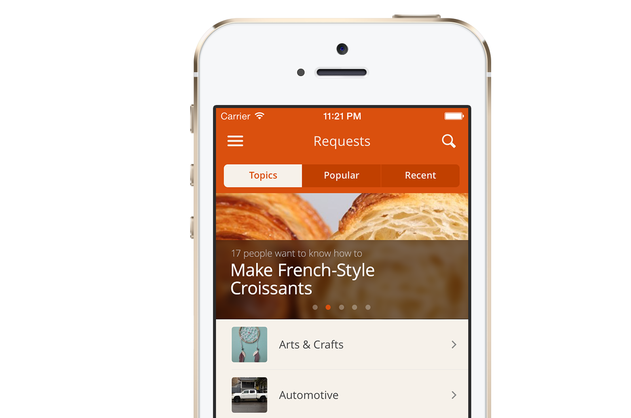
New iOS7 design
The requests design has now been updated for our iOS7 app, along with some small modifications based on user feedback.