Real Estate Platform

I led the UX design for a new real estate platform for Vast. The platform ran multiple real estate search sites. We needed to establish consistent features and UI styles to make sure we could build new instances quickly and push updates at a platform level.
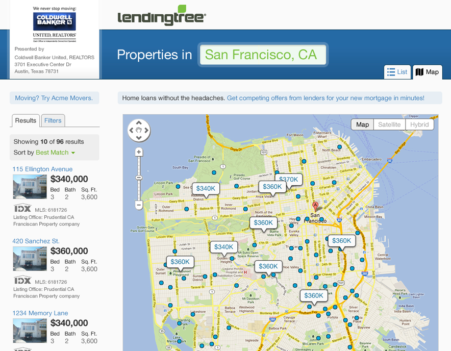
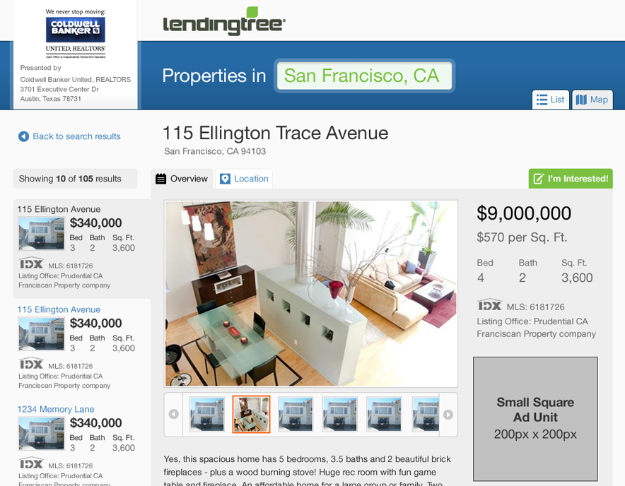
Lending Tree was the first of the platform sites to go live. I used branding styles from the Lending Tree site and applied them to the design layouts we'd been using for prototyping. My colleague then continued the visual design for the full site.
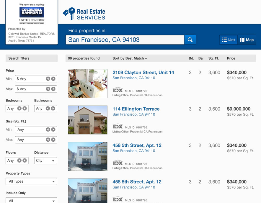
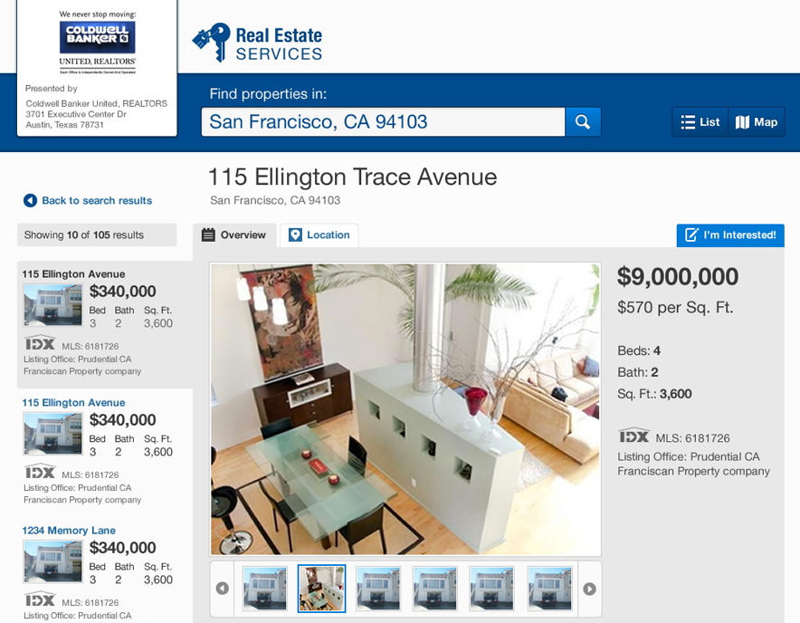
After discussing how to apply styles and grids that would work better across more websites, I re-worked the design for the next site: I made a tighter cleaner grid for the listings that made it easier to scan and compare properties; I moved the buttons up into the header so that they are inline with the search bar making it feel more connected. I changed the styles of the drill on the left so that they looked less like links (like they do on the Lending Tree design) and more like traditional input fields.
Design Principles
I find it helpful to establish goals, personas, use cases and design principles at the beginning of a new project. These were the design principles for the new platform:
- Mantra: simple, meaningful, personal… the right choice, faster.
- A simple but not too clinical UI that shows we’ve got data but with a human touch (somewhere between Google and AirBNB).
- Display data in a meaningful way: using visualizations, chunking of information, quickly scannable and comparable.
- Personalization and control (for location zones and sorting) to allow users to get to the results right for them faster.
- Display fewer but more relevant results as a priority to users (using our vast amounts of data and what we learn from the user while they are using our application).
- Appeal to the emotions of users by using large photos of homes and making them easily and quickly viewable.