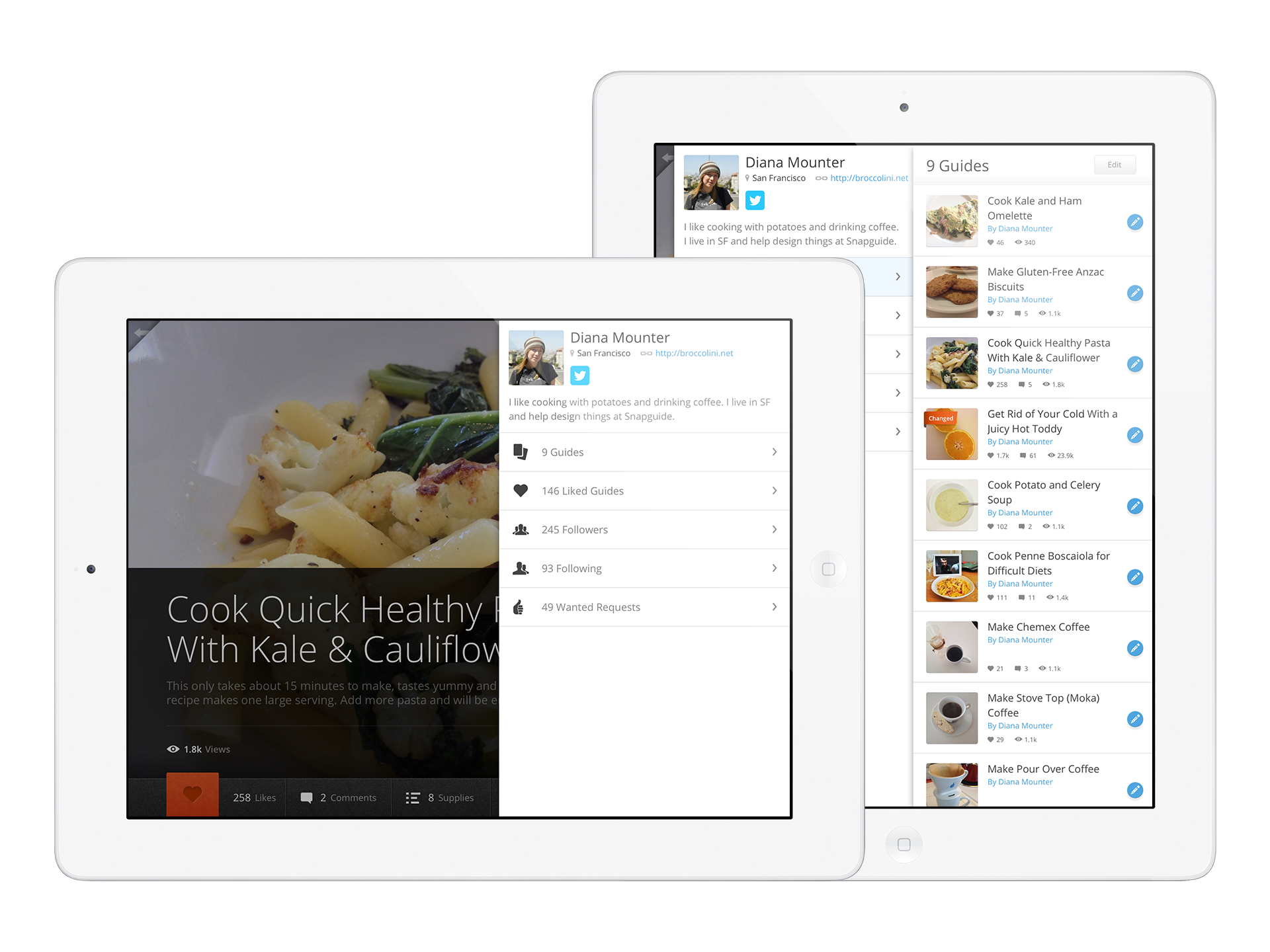
Profiles
User profile views for the Snapguide iPad app
I joined Snapguide when the team were a few months away from launching their first iPad app. They were a team of 6 at the time which included 1 designer and 3 engineers. There was no time for an introductory project, I had to dive straight in and design user profiles for the iPad.
The iPad user interface
The iPad UI had a magazine-type feel so people could browse through guides easily by swiping through pages. The main menu expanded out from a small stub in the top left, which was more unique compared to the common hamburger-style nav you often see on iOS apps.
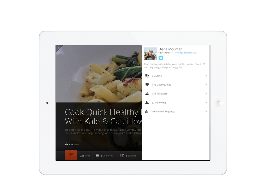
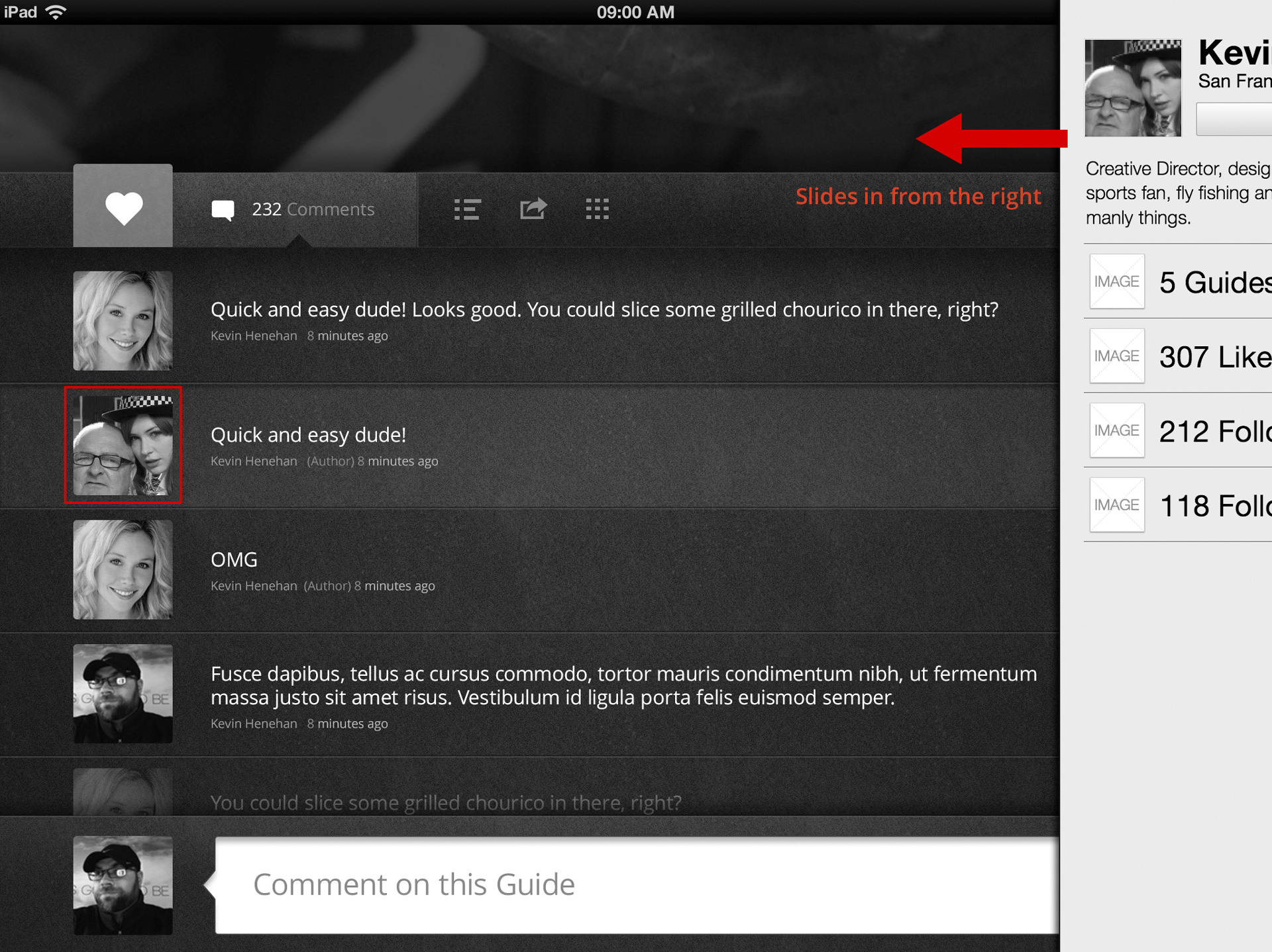
Profiles could be viewed from a number of different places in the UI. As a user viewing other peoples profiles you could view them from featured guide pages, from viewing a single guide, and from avatars associated with comments and likes. Viewing your own profile could be done from the main menu.
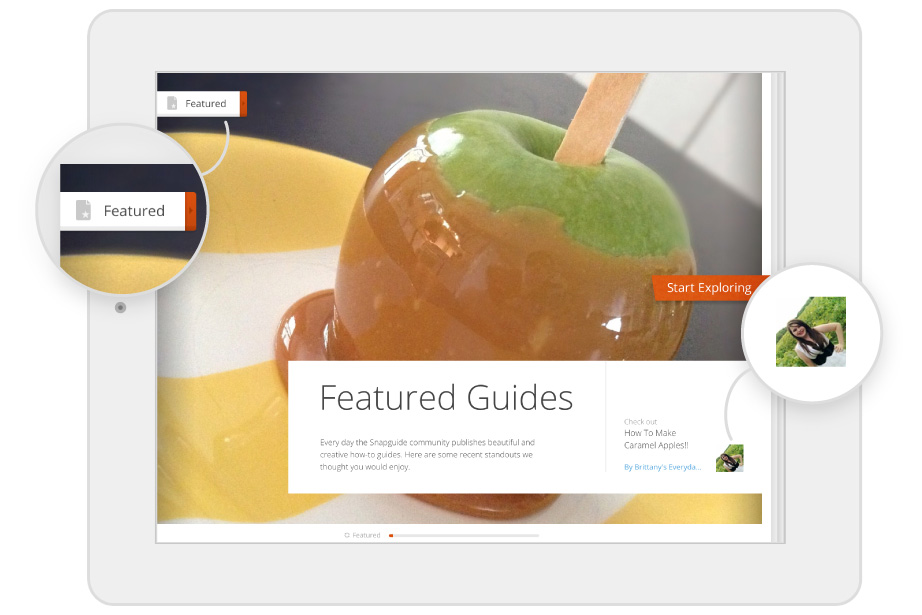
Main menu and profile on feature page
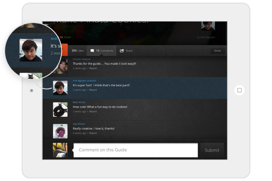
Profile avatar on comments
A few simple designs for profiles had been given to beta testers and the feedback so far had been that they felt quite plain and “not special enough”. They were a full screen popover and the interaction felt awkward with the magazine-style UI.
My goals were to design:
- an interaction that worked with, but felt different to viewing guides,
- an interaction that would work the same when viewing a profile from a variety of different places in the app,
- a profile that would feel “special” to the audience.
Ideation
I started out by researching what other apps and websites did with profiles. I was looking for 2 things in particular - transition styles and profile previews Vs launching into a full profile view. I looked at sites and apps including Facebook, iPhoto, Flickr, Flipboard, Path, Pinterest, and Soundcloud.
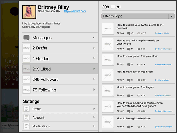
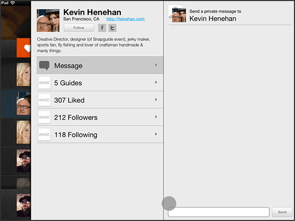
I was considering a preview popover option before launching into a full profile view because profiles needed to be viewed from many different points in the app. I wanted something that wouldn't interrupt the experience of viewing guides but that also allowed you to get a quick overview of the user. I was thinking about previewing stats like the number of published guides and how many followers they had.
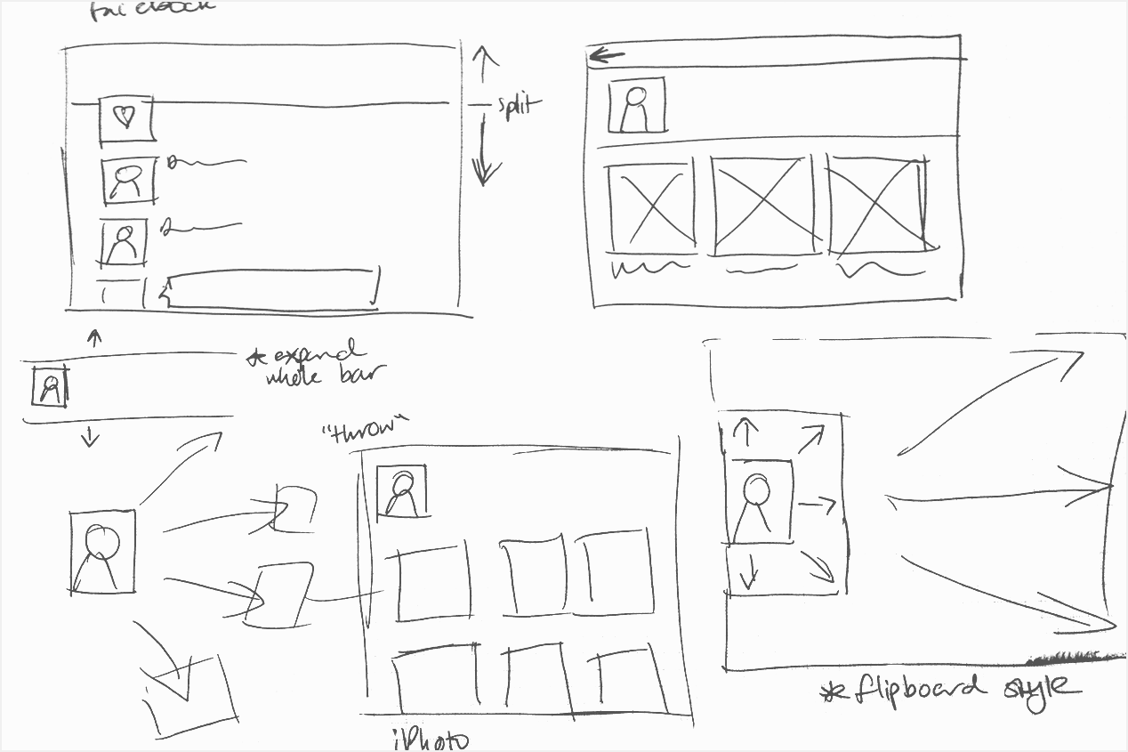
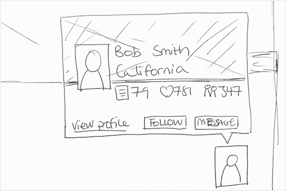
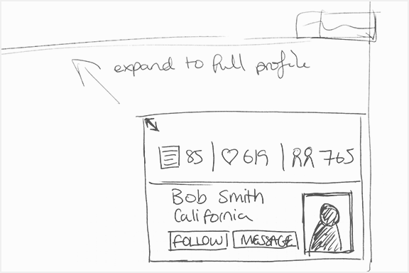
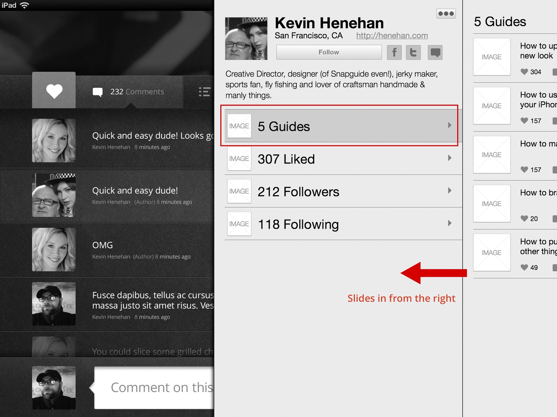
After viewing the Soundcloud app I noticed they had a panel-style UI. This inspired me with the idea that users could tap on user avatars and a panel could slide out from the side. This meant that they would still stay in the guide view but get an overview of a users profile and be able to easily tap into deeper information.
Prototyping
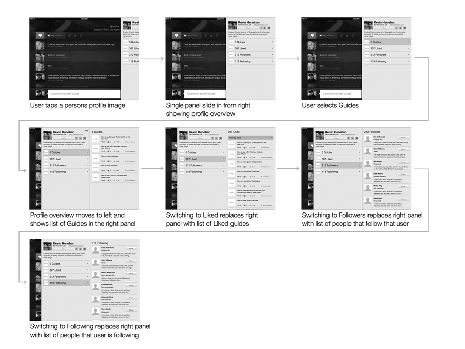
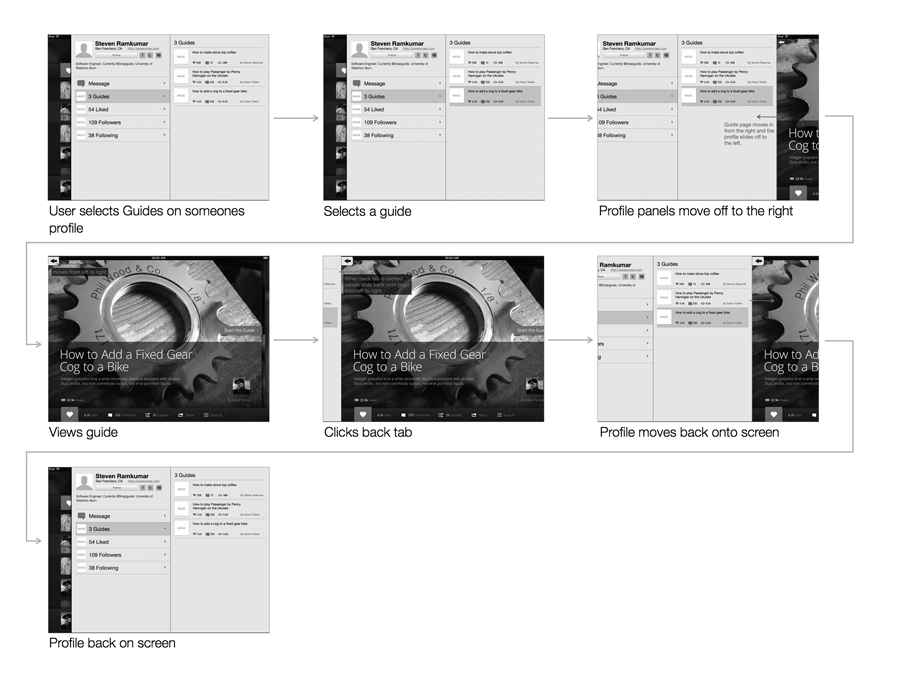
So that I could test my idea with the current iPad design I created wireframes that overlayed the current mockups. I animated the transitions in keynote so that I could test out how the panel-style UI would feel and see if it worked from the different screens.
Showing the animations to the engineers was a great way to show my intent behind profile interactions and allowed us to discuss implementation details.
Specifications
I needed to hand over the spefications to the other designer so they could implement the visual design, and put into a format that could easily accompany tickets for the engineers.
I broke down the animations into steps and anotated the wireframes. I chunked the wireframes into user flows, and before each section I layed out thumbnails with a summary of each step.
The final result
While small tweaks were made, the overall design and implementation closely reflect the specifications I gave to the team. The interaction worked well for profiles and so the same design was then applied for viewing settings and the activity feed.