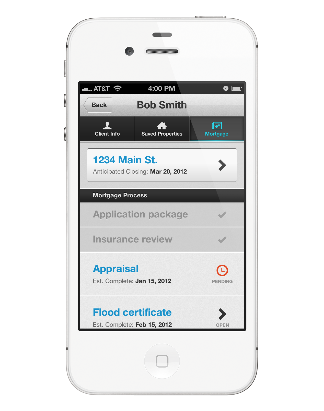
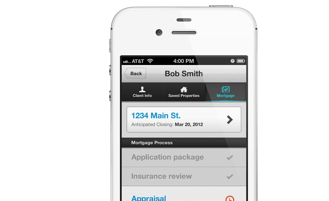
Agent Portal
An app for real estate agents to help them build better relationships with their clients
Agent Portal is one of the first of Vasts own products and was great to have the opportunity to design a new product from the start.
Wireframes and user flows
I like to collaborate with other members of the team when I can to jam UI layouts and information architecture. A key part of that is walking through the various pathways people might take - i.e. the user flows.
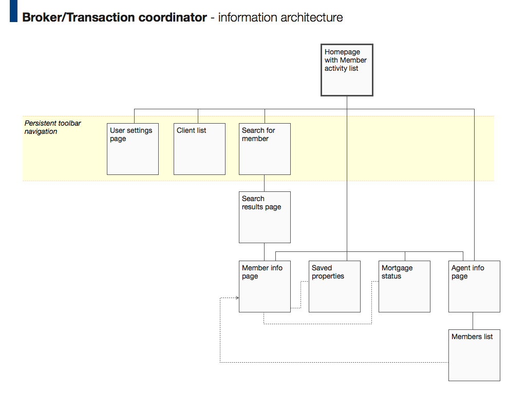
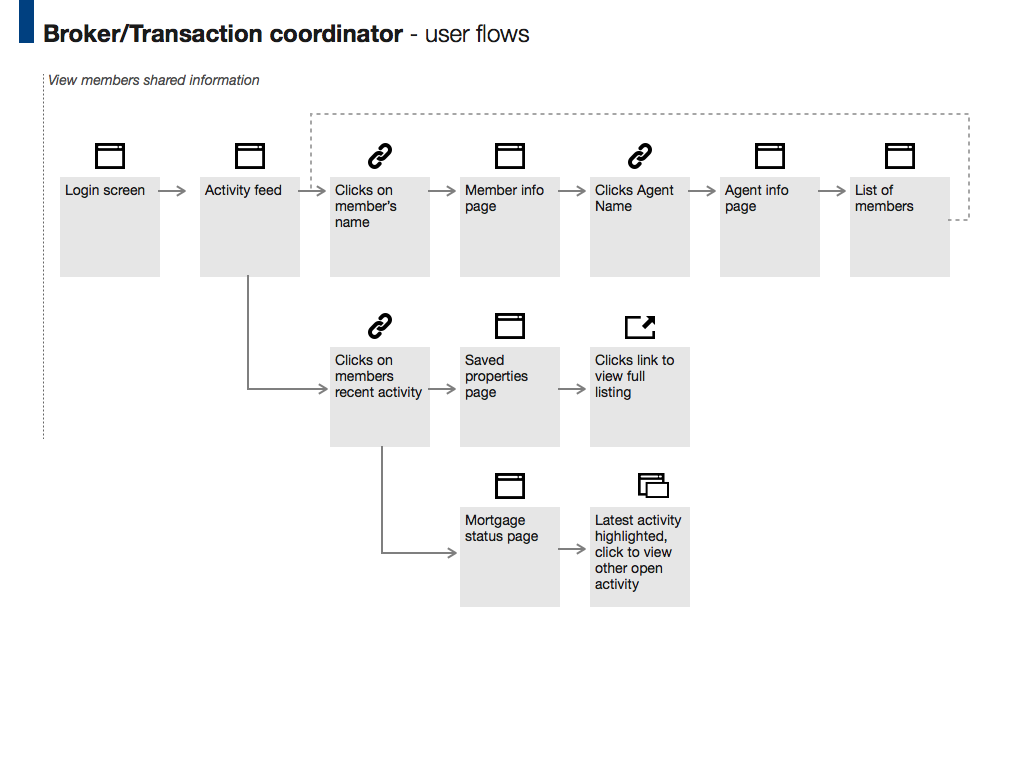
There were four different user types for this project. The IA, wireframes, and user flows proved a great tool to use with the team to communicate how the app would work differently for each user.
Research
We had the opportunity to meet with agents to get some early feedback on our wireframes. We started with some interview questions and asked them about tools they currently use, what devices they use, and in what context they use different apps.
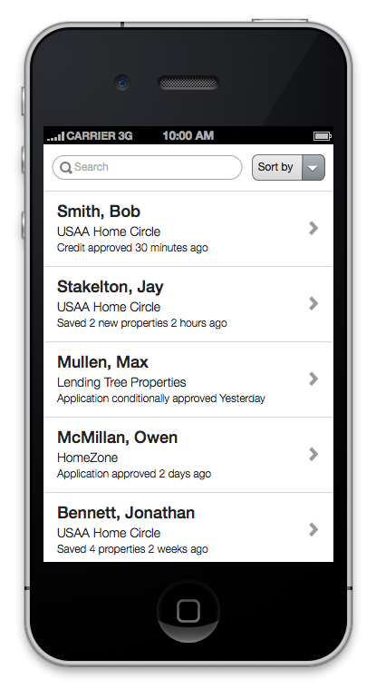
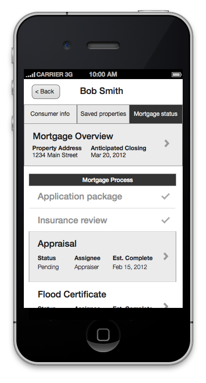
We expected agents to want to use the app on their iPad or mobile when they were out an about with clients. It was good to find that about 50% of the agents used iPads as their primary device. That validated our assumptions that the app needed to work on both mobile devices and the web.
Design Principles
To kick off the visual design phase the designers and product managers did a small workshop session. From that we created mood boards and the following design principles:
Mantra: Professional, modern, intuitive.
The Agent Portal should: Empower the agent with robust and intuitive tools that enable agents to build better relationships with their clients.
How we want them to feel using the app and their impressions towards Vast/the broker: Because the app is well designed with an intuitive UI - is fast, responsive, and reliable - they feel trust and credibility in the app and the Vast brand.
How we want them to feel using the app in front of a client: Because the app allows them to access information quickly and reliably it helps impress and build credibility with their clients. They just can't wait to use the app in front of people!
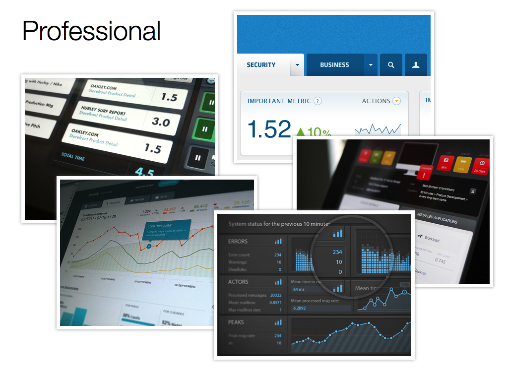
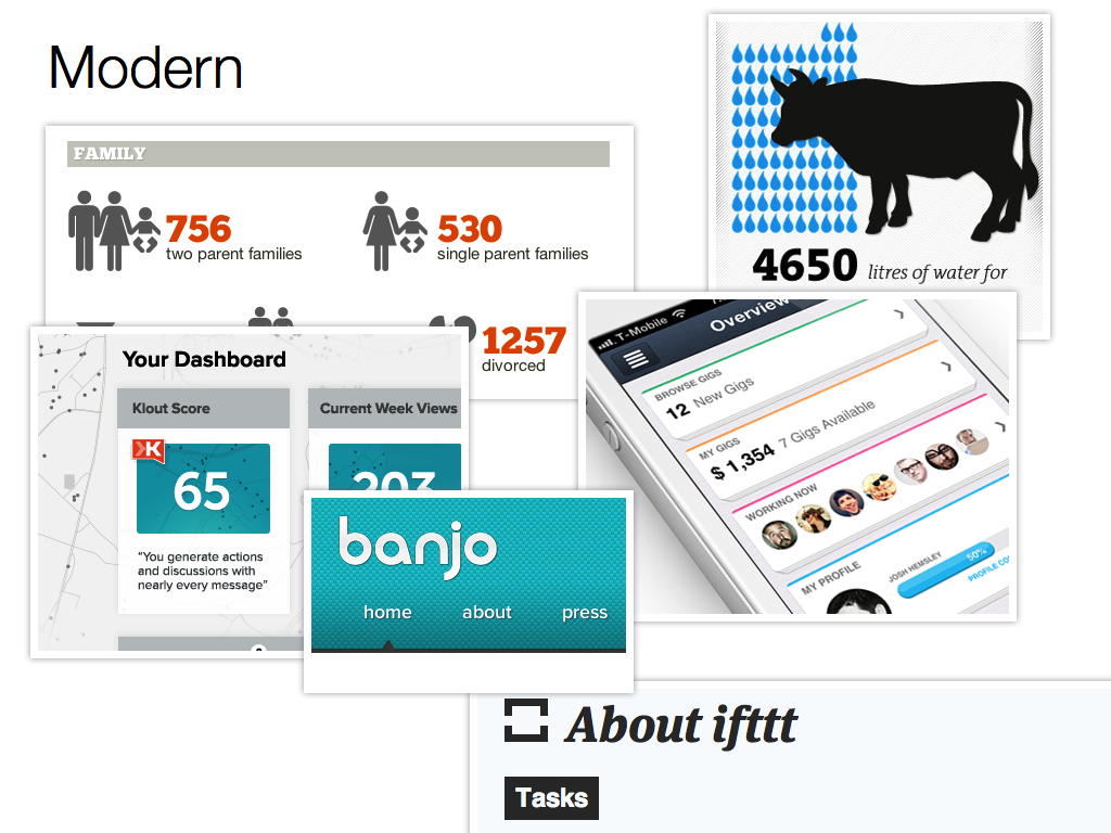
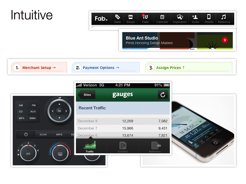
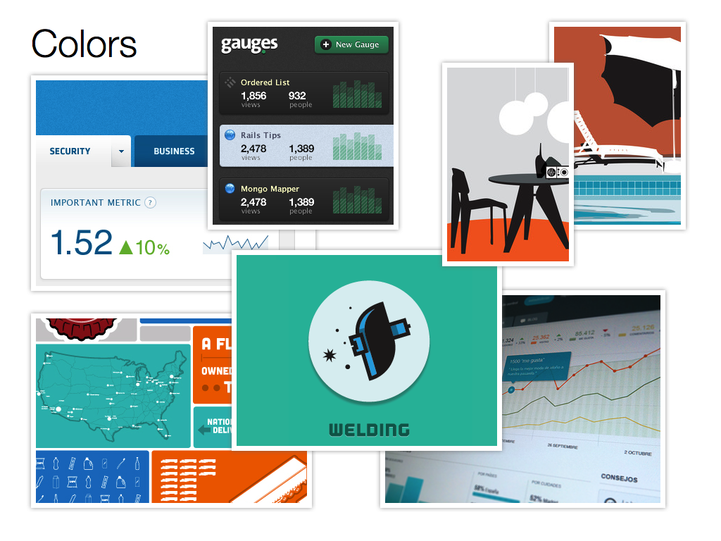
The mood boards I created after the workshop
The Final Product
We considered a responsive design but went with separate mobile and web front-ends. From our research we knew the types of tasks an agent would likely do when they are out and about are different from when they are sat in the office doing research, so we designed the interface to match those needs.
I am unable to share more designs from this project online.
